Chris Ware is an American writer, cartoonist and graphic novelist. His simplified, pictorial illustrations capture the lives of his own original characters, often covering dark and sensitive subject matter.
Study Number One

This was the first study that I started and the last one that I worked on. This was inspired by Ware’s use of direction in his framed comics. One such example of this comes in the form of his 1991 creation Quimby the Mouse [1]. Many of the pages in this early nineties comic can be read in multiple direction thanks to the ambiguous illustrative style of Quimby himself and the numerous narrative paths laid out in the images.
I tried to emulate this in my own figures and layout, although my image remains unfinished. With the starting point ‘I’m so bored. How do I get out of here?’ I created a short sequence of simplified frames depicting my attempted escape from my desk in the University of Gloucestershire Illustration Studio. At the start I worked from the top left square to the top right and all the way down to the bottom right square, later added the six frames coming down on the left. I feel as though it has a definite feel of Chris Ware’s pioneering layouts.
I tried to emulate this in my own figures and layout, although my image remains unfinished. With the starting point ‘I’m so bored. How do I get out of here?’ I created a short sequence of simplified frames depicting my attempted escape from my desk in the University of Gloucestershire Illustration Studio. At the start I worked from the top left square to the top right and all the way down to the bottom right square, later added the six frames coming down on the left. I feel as though it has a definite feel of Chris Ware’s pioneering layouts.
Study Number Two

This style of comic really inspired me creatively and I liked the complexity of designing a similar layout to Ware and King’s. I also tried to capture something rather darker in the narrative of the comic, similar to Ware’s writing style. I wanted to give the impression that something had happened to the daughter character, pictured at different ages throughout the comic, but without being too obvious or blatant. I much prefer the ‘reading between the lines’ part of storytelling.
I hand-drew the image before adding colour using Photoshop. I’m really pleased with how I kept the correct colours throughout the image, electing to add squares of colour with reduced opacities to create tone and mood.
I hand-drew the image before adding colour using Photoshop. I’m really pleased with how I kept the correct colours throughout the image, electing to add squares of colour with reduced opacities to create tone and mood.
Study Number Three

My next emulation was once again, hand drawn, this time taking on a much less linear form to the previous two comics. I took inspiration from a page that I found in one of Ware’s Building Stories [4] publications, but was actually in his Acme Novelty Library before that. In the image, the protagonist of Building Stories gives rein to her suicidal thoughts, the complexity of the layout describing her excruciating mental battle [4]. The ambiguous swirling, corner-turning layout really emphasises her anguish and I was inspired by this. At first I found the image really difficult to read, mostly as there isn’t really a ‘right way up’, but when it comes to the mind I suppose there isn’t one for that either, so I feel as though this confusing layout is appropriate.
I decided to use this technique to describe my own daily battle, perhaps a more cheery one; getting out of bed to go to University in the morning.
I decided to use this technique to describe my own daily battle, perhaps a more cheery one; getting out of bed to go to University in the morning.
Study Number Four

My fourth and final attempt resulted in my only fully digital image. This time I documented my own mundane life using a very limited colour palette and a series of very simplified frames, something that I found Chris Ware does a lot in his work. The way he documents time through very basic events and little or no speech is for the most part what inspired this simple comic. Ware’s comics have been described as a “suggestive description of inner life, of the feeling of time, of memory, of experiencing the world” [4] and I wanted to show that through my own simple memory.
I was also interested in how a lot of his work is quite rhythmic in its layout. Ware is known to have compared his art to music, each frame representing a beat or note in a melody. This is why I have separated my frames the way I have. Two large frames and then four smaller frames repeated over and over, giving the image somewhat of a balance and a flow.
I’m really pleased with how this piece worked out as I am not the most confident person in digital media and this was probably the emulation that took the shortest amount of time to make.
References
[1] klarelijninternational.midiblogs.com, 2015.
[2] hoodedutilitarian.com, 2015.
[3] theperiodicfable.files.wordpress.com, 2015.
[4] Bartual, 2012.
[2] hoodedutilitarian.com, 2015.
[3] theperiodicfable.files.wordpress.com, 2015.
[4] Bartual, 2012.
Bibliography
Bartual, R. 2012. Scandinavian Journal of Comic Art (SJOCA) Volume 1:1. [Online] [Accessed from 2015] Available from: http://sjoca.com/wp-content/uploads/2012/06/SJoCA-1-1-Article-Bartual.pdf
King, F. 1918. Image from Gasoline Alley. [Online] [Accessed from 2015] Available from: https://theperiodicfable.files.wordpress.com/2011/10/gasoline-alley-1.jpg
Ware, C. 1990-1991. Image from Quimby the Mouse. [Online] [Accessed from 2015] Available from: http://klarelijninternational.midiblogs.com/media/00/01/411625023.jpg
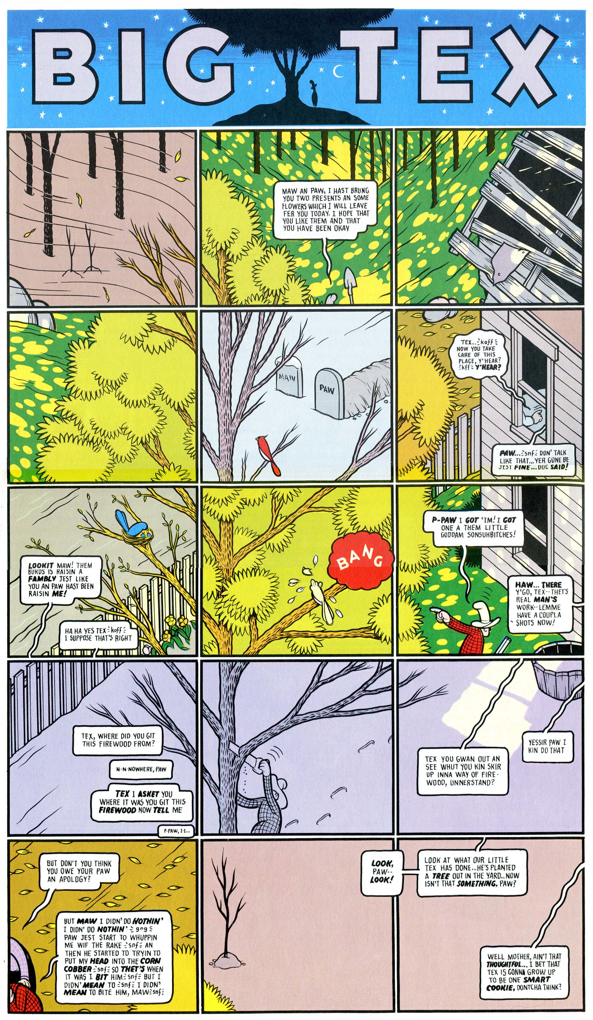
Ware, C. 1996. Image of Big Tex from Acme Novelty Library. [Online] [Accessed from 2015] Available from: http://www.hoodedutilitarian.com/wp-content/uploads/2010/09/Big-Tex.jpg
No comments:
Post a Comment