Monday 7 December 2015

Steve Bell - Political Illustrator


Our fifth and final illustration topic came in the form of political illustration; more specifically we were looking at Steve Bell. When I found out that I would be studying this subject I have to say, I felt a little apprehensive. I have only just become aware of the political world, having only gained the ability to vote in the last couple of years, so I feel as though I don’t know very much about politics. In the end, I feel as though I’ve done quite a good job with my own interpretations, maybe even enjoyed making them.

Study Number One


Whilst I should have been doing work for another module, the idea for this illustration kind of came to me. I thought that the David Cameron Bullingdon Club scandal was too good an opportunity to miss, visually anyway. The story came about out of a rumour about the Prime Minister’s involvement in a society that he was a part of during his time at Oxford University. Claims of an ‘obscene’ initiation [1] relating to a pig and a vaguely sexual act, hit the headlines a few months ago and although the topic is quite taboo, so is a large amount of political illustration. I made this image using Photoshop entirely using my very basic digital painting skills, this reference image [2] and this reference image [3]. I have referenced the children’s programme Peppa Pig, using the character of mummy pig as my tie to the Bullingdon Club story. I had Cameron ask her to ‘call him daddy pig’ as a reference to a common sexual kink and also mummy pig’s male companion in the show, Daddy Pig.

Study Number Two 


For my second political illustration I jumped across the pond to a rather controversial politician, currently running for presidency in the United States. Donald Trump is the famous conglomerate business man undertakings in real estate, sports and entertainment [4], and now politics. His involvement in the run for presidency has been met with criticism and debate for many reasons, perhaps most namely is the candidate’s financial status. I remembered watching an interview with the entrepreneur stating ‘my father gave me a small loan of a million dollars’ [5], referring to when he first started out in business. When I first saw this, my mind instantly flashed back to the Austin Powers films, most importantly the character of Doctor Evil who famously delivers a similar line. So I decided to combine the two and drew Trump in the same pose and costume as the character using this reference image of Trump [6] and this imageof Evil [7].  

Study Number Three


For my third study I chose to use a technique quite commonly used by political cartoonists and illustrators; making a direct parody or reference to a previous work of art, and using this to make a social comment. For my interpretation of this chose to emulate one of my favourite pieces of portraiture, Jan Vermeer’s Girl with the Pearl Earring [8], instead replacing the girl with Russia’s President, Vladimir Putin [9]. My comment on this image is quite a subtle one. Putin is infamous for his opinion and laws to do with the gay and transgender community, and this is chiefly why I chose him to be wearing a pearl earring. There is a stigmata attached to men with pierced ears that is tied to gay stereotypes and assumptions, which gives the image a subtle irony. Overall, I’m quite pleased with the image itself, although it did look better before I inked it.

Study Number Four


My fourth and final image was an attempt at anthopomorphism, yet another technique commonly used by political illustrators. My subject this time was the leader of the UK Independence Party, Nigel Farage. In many photos that I have seen of him the politician usually has his mouth wide open in a sort of toothless grin, such as my reference image [10]. His tight, squinting eyes and flared nostrils were somewhat reptilian and I thought that these were just crying out to be accompanied by a flicking, forking tongue. Using this image as reference [11], I added in these rather monstrous features and gave him a decidedly green skin tone and some grey shading.

References

[1] Mutch, 2015.
[2] Wintour, 2013.
[3] Davies, 2015.
[4] Trump.com, 2015.
[5] Snyder, 2015.
[6] Eggert and Colvin, 2015.
[7] robertkaplinsky.com, 2013.
[8] Ebay.com, 2014.
[9] De Nugent, 2015.
[10] Baker, 2015.
[11] thinglink.com, 2013.

Bibliography

Baker, N. 2015. TheDrinksBusiness.com. Farage forgoes alcohol for January. [Online] [Accessed from 2015] Available from: http://www.thedrinksbusiness.com/wordpress/wp-content/uploads/2014/11/tumblr_inline_n6m8y86oc81r05kcc.jpg

Davies, E. 2015. The Daily Mail. How Peppa Pig has conquered Christmas... and made multi-millionaires of three friends from Middlesex Poly. [Online] [Accessed from 2015] Available from: http://www.thisismoney.co.uk/money/article-3342010/How-Peppa-Pig-conquered-Christmas-multi-millionaires-three-friends-Middlesex-Poly.html

De Nugent, J. 2015. Enemies can bring out the best in us. [Online] [Accessed from 2015] Available from: http://johndenugent.us/images/putin-angry-banks.jpg.pagespeed.ce.fjVlkcA87U.jpg

Ebay.com. 2015. Your Guide to Girl with the Pearl Earring. [Online] [Accessed from 2015] Available from: http://i.ebayimg.com/00/s/NjAwWDUwOQ==/z/ZP8AAOSwh6xTtQAK/$_32.JPG

Eggert, D and Colvin, J. 2015. Yahoo News. Trump says he’ll release policy specifics soon. [Online] [Accessed from 2015] Available from: http://media.zenfs.com/en-US/video/video.pd2upload.com/video.ynewskatiecouric.com@df3727ac-3227-3cc1-9d7b-f1fae7858acf_FULL.jpg

Mutch, N. 2015. Theweek.co.uk. Bullingdon club: inside the elite Oxford society. [Online] [Accessed from 2015] Available from: http://www.theweek.co.uk/65410/bullingdon-club-inside-the-elite-oxford-society

RobertKaplinsky.com. 2013. How Much Money Should Dr Evil Demand? [Online] [Accessed from 2015] Available from: http://robertkaplinsky.com/wp-content/uploads/2013/04/drevil_cover.jpg

Snyder, B. 2015. Fortune.com. Reference to Donald Trump interview. [Online] [Accessed from 2015] Available from: http://fortune.com/2015/10/26/donald-trump-loan-dad/


Trump.com. 2015. Donald J Trump Biography. [Online] [Accessed from 2015] Available from: http://www.trump.com/biography/

Wintour, P. 2013. The Gaurdian. David Cameron: Tories will work hard to win back supporters from Ukip. [Online] [Accessed from 2015] Available from: http://www.theguardian.com/politics/2013/may/03/david-cameron-tories-supporters-ukip


Saturday 5 December 2015

Steven Cooper - Concept Artist


After my confusion with Editorial Illustration, I found out that the next illustrative career path I would be studying would be that of the concept artist. This is a subject that I am quite interested in pursuing, so I was very excited to find out that I we were having a guest speaker. Steven Cooper is a British Concept Artist who has produced work for TV, Film and Video Games. During his talk with us he described a lot of his creative processes, most of which were inspired by Surrealist methods, involving wet and dry media.

Study Number One

My first concept-art-inspired piece involved a rather messy process often used by Surrealists. Decalcomania [1] is a process involving wet paint on a flat surface, transferred to another flat surface through compression and pushing and pulling the material away. In this case I applied a mixture of blue and yellow paint onto a piece of clear acetate, applied it to a blank piece of paper with a little bit of pressure and pulled the acetate away. The ‘capillary attraction’ of the liquid in the paint creates marks and patterns on the page and then the shape that is created is the basis of a piece of work. I decided that the swirling shape and sea-like colour palette reminded me of a breaking wave, so I emphasised this using some blue ink and a tissue to add a sort of mist above the wave, and a couple of biros to draw in a small sail boat over the crest of the wave.

Study Number Two


My second image was inspired by a technique that Steven Cooper was rather a fan of and was also used by surrealists such as Max Ernst. Soufflage [1] is a technique that also uses wet media, this time ink that is blow across a flat surface using a straw. During our talk, Steven mentioned that he liked to use gel ink pens with water to let them bleed and then either blowing them around or letting gravity take hold so that they would drip down the page. At first I used some of my own gel based pens with water but I found that these didn’t bleed very well so I added some black ink which took much better to the water on the page. After I was done, I felt that the shape that was made looked like a large dramatic cloak so I decided to turn it into a villainous costume, using an ink wash, a sharpie and Photoshop to create an evil king. 

Study Number Three


My third piece involved quite a different influence that Steven spoke about. He mentioned that a lot of his figures and structures involving machinery were strongly influenced by the famous concept artist HR Giger, who made the art that inspired the Alien films. With a little bit of research I discovered that a lot of Giger’s work is very overtly sexual and almost always uses a mixture of human figures and features and science-fiction technology. I took one of his books out of the University library and straight away I discovered that he has made a large number of portraits incorporating these elements, for an example see here [2]. In response to this I made the above drawing, using pencil, a black biro and a black fine-liner, later adding a coffee wash and a light enhancement on Photoshop to give the signature sepia-toned effect.

Study Number Four


My fourth and final attempt at concept art brought me back to another one of Steven’s techniques that were also used by the surrealists. Frottage [1] involves taking a rubbing of a textured surface using a soft, dry material such as a chalk pastel or condensed charcoal and a thin piece of paper. The mark that is made then forms part of a drawing or can be left on its own as a full image. Inspired by this I made some rubbings onto a piece of corrugated card, which I decided looked like high-rise buildings and sky-scrapers. I made five of these and using Photoshop I arranged them to form the skyline that you can see above. This was a welcome break from my other studies as I noticed that I made a lot of character and figure-based images in response to this subject and this was my first attempt at something more environmental.

References

[1] Wikipedia.org, 2015.
[2] Vagallery.com, 2015.

Bibliography

Giger, HR. 2015. Vagallery.com. Image of Giger portrait. [Online] [Accessed from 2015] Available from: http://www.vagallery.com/h-r-giger.html

Wikipedia. 2015. Surrealist techniques. [Online] [Accessed from 2015] Available from: https://en.wikipedia.org/wiki/Surrealist_techniques


Thursday 3 December 2015

Eric Fraser and Aude Van Ryn - Editorial Illustration


Of all of the subjects that I have studied during this project, this has been the one that has proved the most difficult for me. At first, I’d never really heard of this branch of illustration and so I was really unfamiliar with the techniques and practices that editorial illustrators use. One quotation that has really helped me understand this line of work is this; ‘The essence of editorial Illustration is visual commentary. Its principal function is to be symbiotic with journalism contained within the pages of newspapers and magazines’. Often these images will be used to describe a concept, an abstract thought or a sensitive subject, without being too cliché or obvious.
One Illustrator who is particularly famous for this type of work is Eric Fraser. Most famous for his work with the Radio Times, his iconic black and white illustrations were used to describe many conceptual topics such as silence, life, death and war.


Study Number One


The first image I made for this category of illustration actually didn’t make the blog. As practice I made a drawing to ‘fill in the gap’ in an article from the Guardian, the title of which was ‘Why your gullibility is a goldmine’. At first I made an illustration describing a rather fashionable young woman purchasing a ‘Gucci’ handbag from a man on the street with a shopping trolley full of ‘real designer wares’. This however was drawn in portrait orientation and after having a think about it I realised that this would never fit into the space provided for an illustration in the article layout. Instead I took inspiration from Eric Fraser’s surreal, graphical style and made this. I wanted to reference something that not many people believe in as a working product, so I cast my mind back to the ‘miracle tonic’ sellers of older times. I also think this image fits in well with Fraser’s archaic style, as much of his work was made in the earlier part of the 20th century and so a lot of his subject matter refers to religious and old-fashioned scenes. I took a lot of inspiration from this particular image.

Study Number Two


My second study saw me emulating a different Editorial Illustrator, Aude Van Ryn. This artist was a lot more contemporary and in my opinion easier to understand thanks to her graphic, almost diagrammatic style. One technique that Van Ryn uses quite often is the use of silhouettes and basic shapes. Here I used these to loosely describe business, a subject that I feel would feature quite heavily in a newspaper, and perhaps it would need accompanying with an image. I decided to abstract the concept, breaking it down into what I feel business is; buying and selling. This is why I chose to depict a character selecting their desired product from a group of objects, which have been presented to her by another character, a small business owner perhaps?

Study Number Three


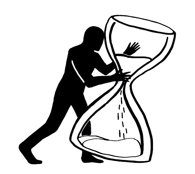
My third attempt saw me turn to silhouettes once again. This time I pared my illustration with the image of an hourglass.  Through my research I noticed that the hourglass is quite commonly used throughout editorial illustration, as this is a well known and recognisable symbol of time. Again I tried to convey visually, an abstract or sensitive subject; in this instance the concept was terminal illness. I wanted the figure to represent the illness itself, tampering with or even terminating the remaining time in the hourglass.

Study Number Four


To complete my last emulation, I once again took inspiration from Aude Van Ryn, this time using another of her techniques. I noticed that she uses a lot of toned-down blocks of colour to describe clothing, backgrounds and objects which interact with her figures. For the purpose of this exercise I decided to use a human face with a surreal twist to describe how I feel about my studies at the moment; stressed and confused. I wanted her expression to read as calm and collected, but for the spiral in her head to be almost difficult to read to represent her anxiety and nervousness. The original colours were those in the left hand image, however as I was playing around with the layer settings I noticed that putting the image into negative would actually give an colour palette  much closer to the one that Van Ryn uses to describe her figures. A comparative example of this can be found here [3]. 


References

[1] Male, 2007.
[2] Taylor, 2013.
[3] Van Ryn, 2015. 

Bibliography


Taylor, J R. 2013. Image of ‘Silence in Heaven’. The Times. [Online] [Accessed from 2015] Available from: http://www.thetimes.co.uk/tto/multimedia/archive/00410/127121568_Fraser1_410272c.jpg

Van Ryn, A. 2015. Image of silhouette figure. Heart agency. [Online] [Accessed from 2015] Available from:  http://www.heartagency.com/store/images/3542/main/vanryn_lge_11.jpg?1392397481