Of all of the subjects that I have studied during this
project, this has been the one that has proved the most difficult for me. At
first, I’d never really heard of this branch of illustration and so I was
really unfamiliar with the techniques and practices that editorial illustrators
use. One quotation that has really helped me understand this line of work is
this; ‘The essence of editorial
Illustration is visual commentary. Its principal function is to be symbiotic
with journalism contained within the pages of newspapers and magazines’. Often
these images will be used to describe a concept, an abstract thought or a
sensitive subject, without being too cliché or obvious.
One Illustrator who is particularly famous for this type of work is Eric Fraser. Most famous for his work with the Radio Times, his iconic black and white illustrations were used to describe many conceptual topics such as silence, life, death and war.
One Illustrator who is particularly famous for this type of work is Eric Fraser. Most famous for his work with the Radio Times, his iconic black and white illustrations were used to describe many conceptual topics such as silence, life, death and war.
Study Number One

The first image I made for
this category of illustration actually didn’t make the blog. As practice I made
a drawing to ‘fill in the gap’ in an article from the Guardian, the title of
which was ‘Why your gullibility is a goldmine’. At first I made an illustration
describing a rather fashionable young woman purchasing a ‘Gucci’ handbag from a
man on the street with a shopping trolley full of ‘real designer wares’. This
however was drawn in portrait orientation and after having a think about it I realised
that this would never fit into the space provided for an illustration in the
article layout. Instead I took inspiration from Eric Fraser’s surreal,
graphical style and made this. I wanted to reference something that not many
people believe in as a working product, so I cast my mind back to the ‘miracle
tonic’ sellers of older times. I also think this image fits in well with Fraser’s
archaic style, as much of his work was made in the earlier part of the 20th
century and so a lot of his subject matter refers to religious and old-fashioned
scenes. I took a lot of inspiration from this particular image.
Study Number Two

My second study saw me
emulating a different Editorial Illustrator, Aude Van Ryn. This artist was a
lot more contemporary and in my opinion easier to understand thanks to her
graphic, almost diagrammatic style. One technique that Van Ryn uses quite often
is the use of silhouettes and basic shapes. Here I used these to loosely
describe business, a subject that I feel would feature quite heavily in a
newspaper, and perhaps it would need accompanying with an image. I decided to
abstract the concept, breaking it down into what I feel business is; buying and
selling. This is why I chose to depict a character selecting their desired
product from a group of objects, which have been presented to her by another character,
a small business owner perhaps?
Study Number Three
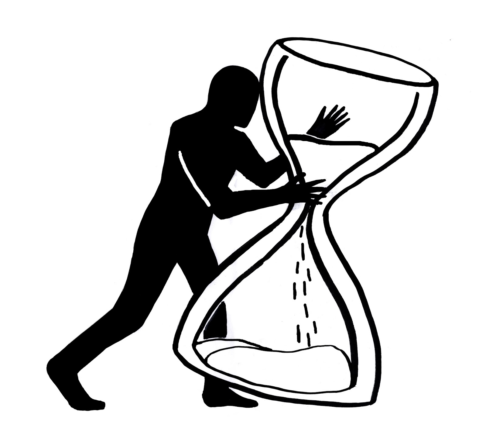
My third attempt saw me
turn to silhouettes once again. This time I pared my illustration with the
image of an hourglass. Through my
research I noticed that the hourglass is quite commonly used throughout
editorial illustration, as this is a well known and recognisable symbol of
time. Again I tried to convey visually, an abstract or sensitive subject; in
this instance the concept was terminal illness. I wanted the figure to
represent the illness itself, tampering with or even terminating the remaining
time in the hourglass.
Study Number Four

To complete my last
emulation, I once again took inspiration from Aude Van Ryn, this time using
another of her techniques. I noticed that she uses a lot of toned-down blocks
of colour to describe clothing, backgrounds and objects which interact with her
figures. For the purpose of this exercise I decided to use a human face with a
surreal twist to describe how I feel about my studies at the moment; stressed
and confused. I wanted her expression to read as calm and collected, but for
the spiral in her head to be almost difficult to read to represent her anxiety
and nervousness. The original colours were those in the left hand image,
however as I was playing around with the layer settings I noticed that putting
the image into negative would actually give an colour palette much closer to the one that Van Ryn uses to
describe her figures. A comparative example of this can be found here [3].
Van
Ryn, A. 2015. Image of silhouette figure. Heart agency. [Online] [Accessed from
2015] Available from: http://www.heartagency.com/store/images/3542/main/vanryn_lge_11.jpg?1392397481
References
[1] Male, 2007.
[2] Taylor, 2013.
[3] Van Ryn, 2015.
[2] Taylor, 2013.
[3] Van Ryn, 2015.
Bibliography
Male,
A. 2007. Illustration: a theoretical and contextual perspective. Lausanne, AVA Academia. . [Online] [Accessed from 2015]
Available from: https://books.google.co.uk/books?hl=en&lr=&id=rlJP8I1cao8C&oi=fnd&pg=PP2&dq=illustration:+a+theoretical+and+contextual+perspective.&ots=flQi81IWUW&sig=zqVNSKRrXieRubV0cVkRyQvUHU0#v=onepage&q=illustration%3A%20a%20theoretical%20and%20contextual%20perspective.&f=false
Taylor,
J R. 2013. Image of ‘Silence in Heaven’. The Times. [Online] [Accessed from
2015] Available from: http://www.thetimes.co.uk/tto/multimedia/archive/00410/127121568_Fraser1_410272c.jpg
No comments:
Post a Comment